top of page
" One Property "
Re-design House & Condo searching Website

UXUI Studio Classroom Group Project:
Redesign Website and Responsive design for iPhone 13 pro.

Role & Responsibilities
My Role
UX Research
UX/UI Design
Project Durarion
Group Project
2 Weeks
Tool Used
Figma
Zoom
Line
Overview
Project Overview
This is a UXUI Studio classroom group project that I attended.
The name of our project is "One Property" which is a search house and condominium website. We re-designed from this website https://maps.envi.dev/
Problem
The original website https://maps.envi.dev/ does not show much information that users need to know.
Here are user pain points :
-
There is no filter about room types, room areas, Buy or rent, Nearby places, or Facilities.
-
The result just shows text information and should have pictures
-
There is no comparison feature for user's interesting places
-
User Interface Design seems difficult to use
Solution
Making the website more user-friendly by understanding user need and pain point, also re-designing the information architecture and user interface.
Design Process

Understanding
Understanding
We have found that the main idea of this website is making user search for their home or condominium easier by seeing on the maps. We decided to discuss what are the pros and cons of this home page.
Define
Although, the website https://maps.envi.dev/ has interesting ideas.
But we discovered the pros and cons of the website and that we can improve it to be more user-friendly and provide a better user experience.
Define

Pros
-
Users can easily see where the location is on the map.
-
Users can use the filter to narrow down what they need.
-
The information on the website is reliable because it is based on the property website: www.gobestimate.com
Cons
-
There is no appropriate navigation bar or search tab, so users are unsure where to begin.
-
All the information is only on a page that makes the web site appear very tight and the layout between the filter section and the map is not the balance.
-
The search result is only text with no link, so users cannot click on to see more information about the location.
-
There is no comparative function, which makes it easier to make a decision.
User Persona
May
" I want to find a place where I can feel at home."
Behavior
-
Detail-Orient
-
Hard-working
-
Have no house in Bangkok
-
Worried about transportation and security
-
Having pets
-
Healthy living and like exercise
Demographic
Gender
Age
Status
Occupation
Location
Income Range
Car
: Female
: 25
: Single
: Accountant
: Chiangmai, Thailand
: 27,000฿
: No private car
Need & Goal
-
Wants a condominium connected with BTS/MRT
-
Pet-friendly condominium
-
Located near convenient places.
-
Having facilities like gym, garden, swimming pool.
-
Wants to see all informational details such as price, photo, and room area.
-
Wants to read the customer's opinion for each place.

Ideate
Ideate Solutions
We designed a new site map to make the website more understandable.
Here is the solution that we created.
-
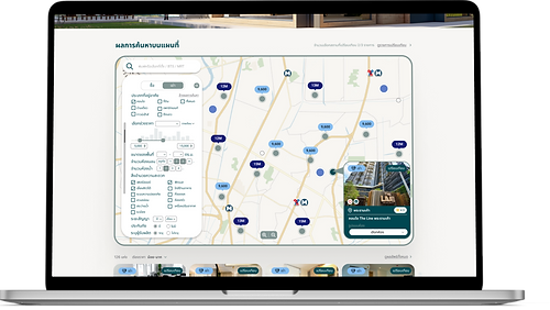
Provide a navigation bar and search tab, so that the user may find what he wants easier.
-
Keep the big frame of the map and put the filter feature in the framework of the card with
more necessary options. -
The search result will be displayed as an information map that contains the photo, room,
and client rating and users can view further details by clicking on the maps. -
Customer reviews after using this site for finding living places.
-
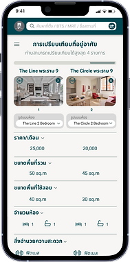
A comparison feature is available for users who want to compare multiple locations.
This makes the decision-making of users easier.
Sitemap
.png)
Prototype
Prototype
We created medium-fidelity wireframes based on user pain point and user need.
Then develop them into high-fidelity wireframes by using Figma.
Figma Prototype: http://bit.ly/3EKWDrr


Responsive Design
Responsive Design
We practiced designing a responsive design prototype for iPhone 13 pro.
Figma Prototype: https://bit.ly/3AsUHkG
Home

Home

Filter

Search Results
Comparison


Before & After Redesign UI
Before

After
( Desktop Version)

After
( Mobile Version)

.png)

Lesson Learned
Information architecture is significant
The organization of information makes it easy for users to find what they want.
This is the key to a great user experience.
Team Player
Working in a team is a lot more fun than on our own because we can share our opinions
and ideas together. I'm very fortunate that my team is very keen on this project.
Thus, we are able to reach the goal more quickly and smoothly.
bottom of page