
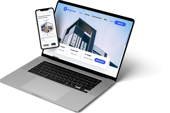
Best Builder
A website and mobile application
that help you find the right constructor
who makes your dream home comes true.
Role and Responsibilities
My Role
UX Researcher
UX Designer
UI Designer
Project Duration
2 Months
Oct - Dec 2022
Tools Used
Figma
Zoom
Paper&Pen
Project Overview
This project is a platform that combines professional construction companies where users can feel comfortable hiring them and building their dream homes without worries.
Problem
The most disturbing process to build anything is the construction process.
Here are user pain points
-
Have been tricked by the constructors.
-
The constructors do not respect the contracts.
-
Have no idea where to find professional constructors.


Solution
A reliable platform that provides the construction company profile, customer review, and third-party services on the quality control and inspection processes.
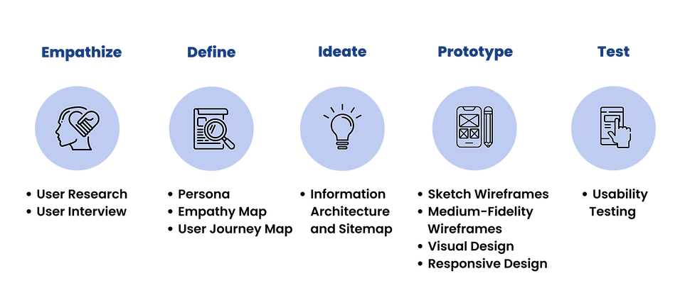
Design Process
.png)
Empathize
Research Method: User Interview
Since this was difficult for the user to find a professional construction company,
I would like to go over their sensitivities, their needs, and their understanding so that I can better understand them.
Therefore, in the research process, I selected the user interview method because it is qualitative research.
Interview Question
-
Do you have experience in the construction and renovation of your home?
-
Could you tell us step by step about your experience in building homes?
-
Can you tell us how you have resolved these issues?
-
Could you explain your payment process with the construction company?
-
Have you ever used a platform like a website or application for a construction firm?
-
If you had a magic wand, what function or service do you want to see on this platform?
Analysis and Interview Outcome
Insight
-
Users generally ask their friends to refer construction companies.
-
Users do not have time to observe when constructors are in operation.
-
Users want to hire a professional constructor who can be trusted with great quality and services.
Pain Point
-
Users have no idea where to find good/professional manufacturers.
-
Users were tricked by builders, for example, the builder concealed the purchase of inferior materials and used them, which affects the quality of the house's structure.
-
Users are paranoid about hiring constructors because they have seen bad companies in the news or heard comments from friends.
-
Constructors did not follow the work process as in the agreement/contract.
-
Since users have no knowledge about the building process, they do not know when builders cheat until the job is done and have bad qualities.
Define
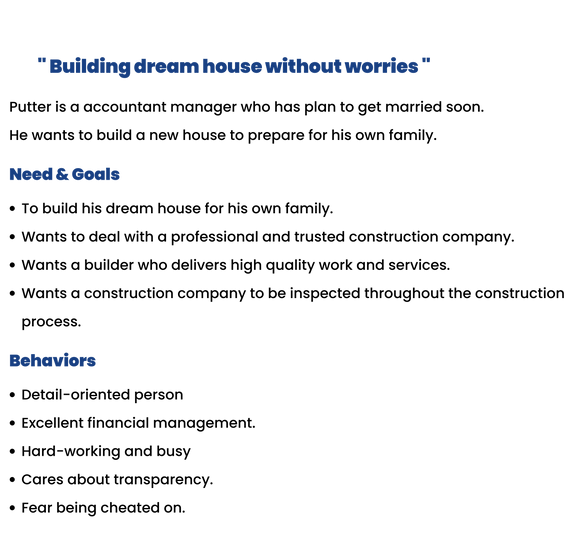
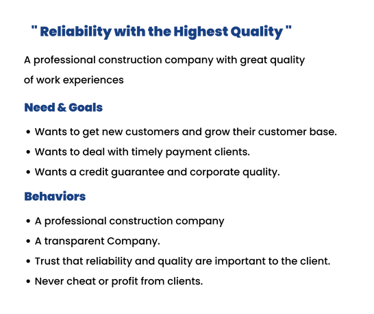
User Persona
I created this user persona based on 5 user interviews to represent my ideal
user which consists of demographic, needs and goals, and behavior.

.png)

.png)
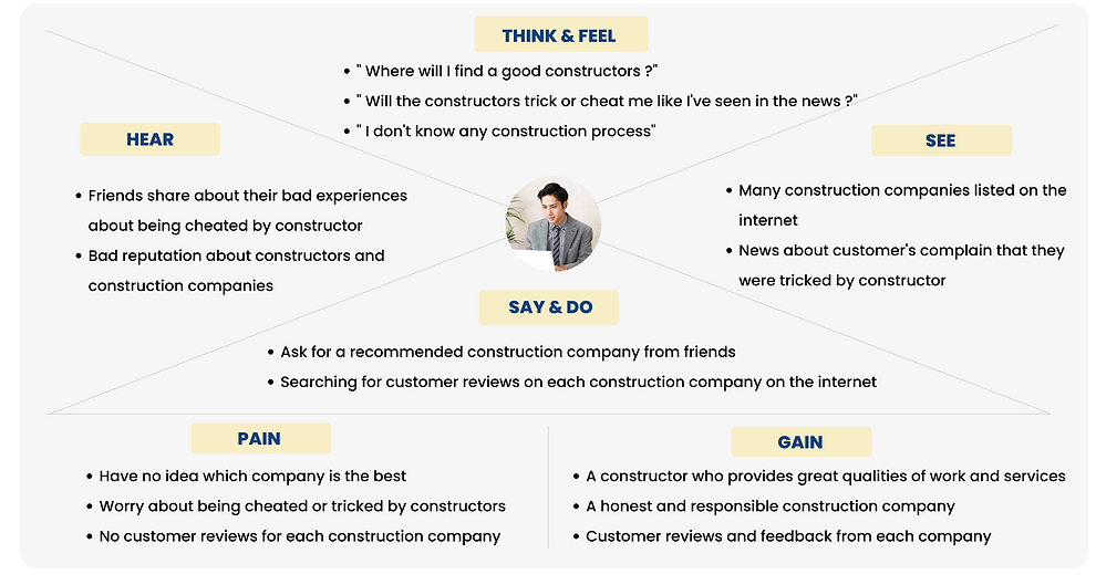
Empathy Map
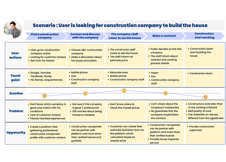
Scenario: The user is looking for a construction company to build new house
User Journey Map
Ideate
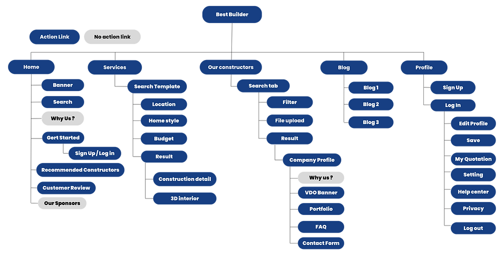
Information Architecture and Sitemap
I have categorized content and created information structures.
This makes it easier for the user to find what they are looking for.
Prototype
Sketch Wireframes
I started with a simple design for the website and a responsive design by sketching on paper. The layout and content design is based on user pain points.
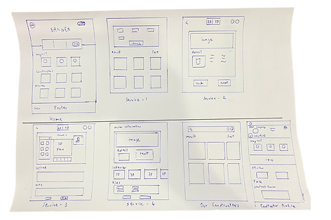
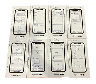
Sketch of homepage website
Sketch of responsive design
for mobile
Medium-Fidelity Wireframes
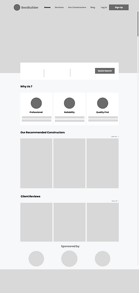
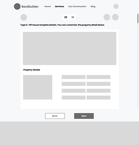
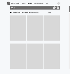
After I finished the sketches. I designed wireframes by using Figma and created basic ideas of what the website looks like.
Visual Design
Design system
Typography
Poppins
H1 Heading
H2 Heading
H3 Heading
Body 1
Body 2
Bold /36 px
Bold /28 px
Bold /24 px
Regular /20 px
Regular /16 px
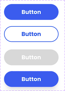
Buttons
Hover
Primary
Secondary
Disable
Primary
Blue#3B5CEE

Black #00000
Secondary
White#FFFFF
Grey #6C6B6B
LightGrey #F6F8FA
Colors


Navigation Bar
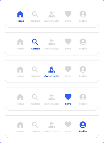
Icons
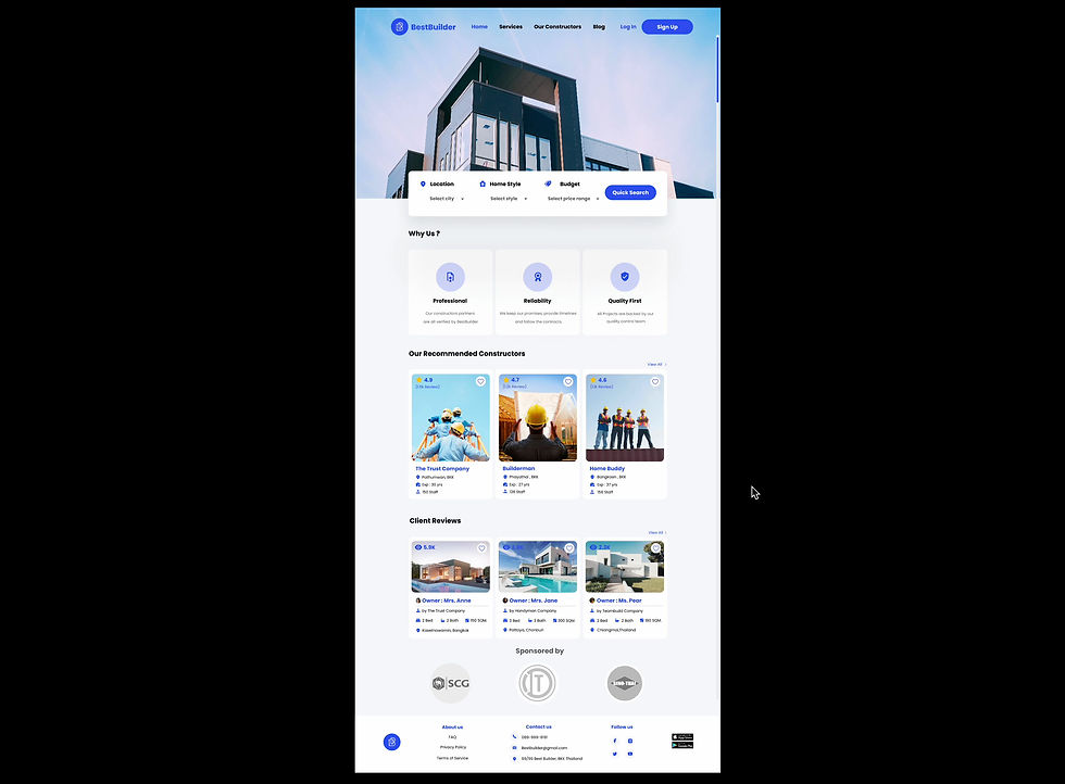
Homepage
On the homepage, I have designed the content based on user needs, which consisted of the topics as follows;
Figma Prototype: http://bit.ly/3FAESvl
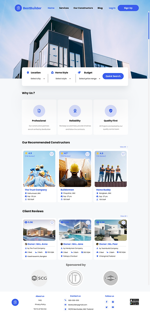
1. Navigation Bar
Allow users to navigate different categories and
I chose the most popular topics based on
user needs.
Home: Introducing the brand identity and
reliability of this website, recommended
constructors, client reviews, and sponsors.
2. Quick search
This section is where to start the services,
Users can select the brief details of what
they are looking for.
3. Why us
This part represents brand identities which are
Professional, Reliability, and Quality First.
These are brand strengths that solve
user pain points.
4. Recommended constructors
One of the most important pieces of information
for users is the construction company’s profile.
I have designed the card which consists of the
company’s name, location, year of experience,
the quantity of staff, and client reviews.
All of this will make the user knows more about
the company’s background and easier to make
a decision.
5. Client Review
Based on the user interview, the client review
is very important and affects decision-making.
I have designed button cards for customers’
house pictures and construction details.
Services
After users have logged in or completed the signup process, they will start to create their quotation forms by selecting their construction details.

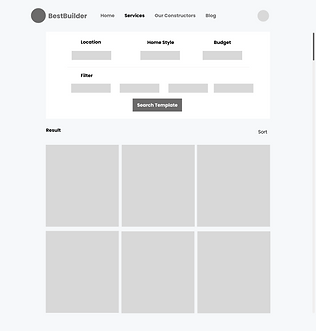
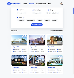
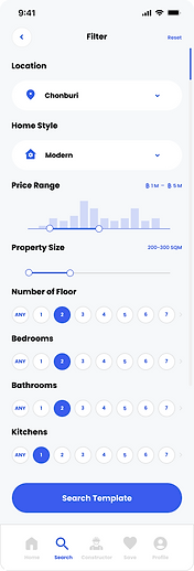
This part is the filter of construction details.
Users can select and then search for
house templates.
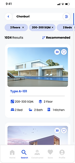
The results will appear below the filter bar
which they can select each one to see
more details.
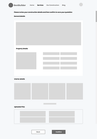
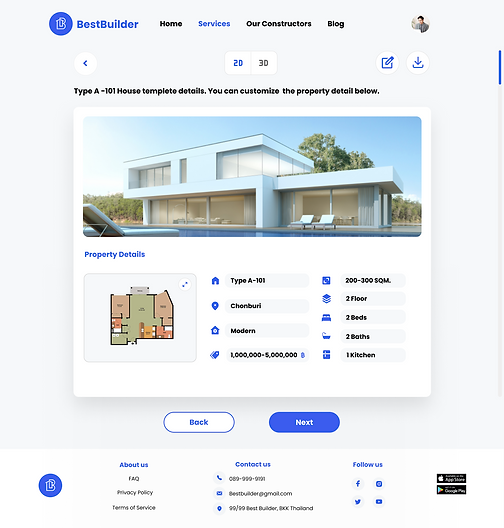
After users click on the template. There will be
a picture of the house and the property details.
Users can customize the details by clicking
on the edit button and can save the information
whenever they want.
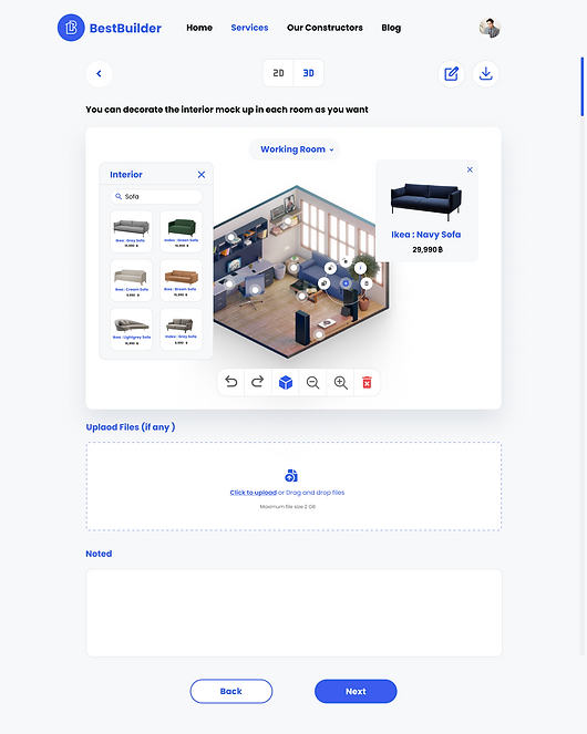
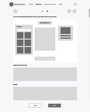
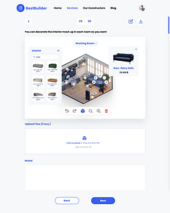
Next part, the users can pick up the furniture
to decorate their 3D house plan mock-up
in each room by searching the interior tab
and the furniture information is linked with
Ikea, Index, etc. This will help user can see
what
their place will look like.
Moreover, they can upload reference pictures
and leave notes to the constructor.
After users select all of their construction
details, they will have to review all of the information and confirm. If they would like to edit some details, they can go back to the previous pages.
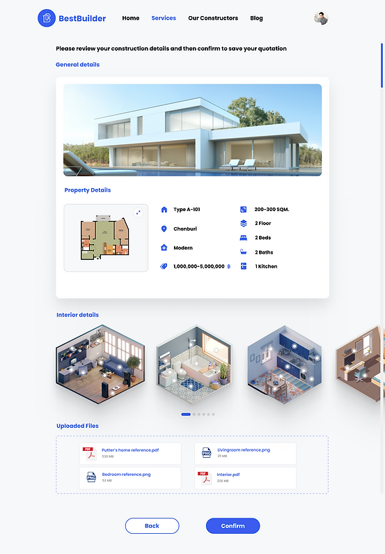
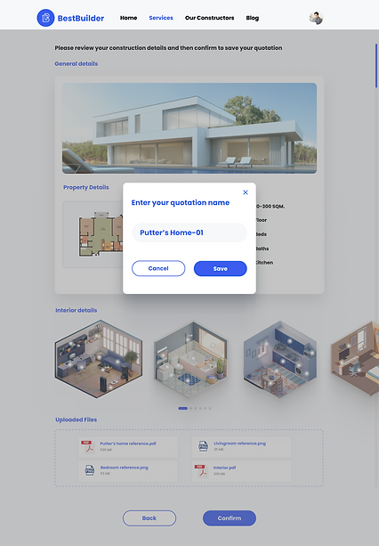
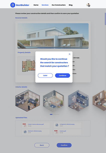
If the users confirm all the information, the quotation will be saved to their profile. Then they can choose to continue finding constructors now or later.
Find Constructors
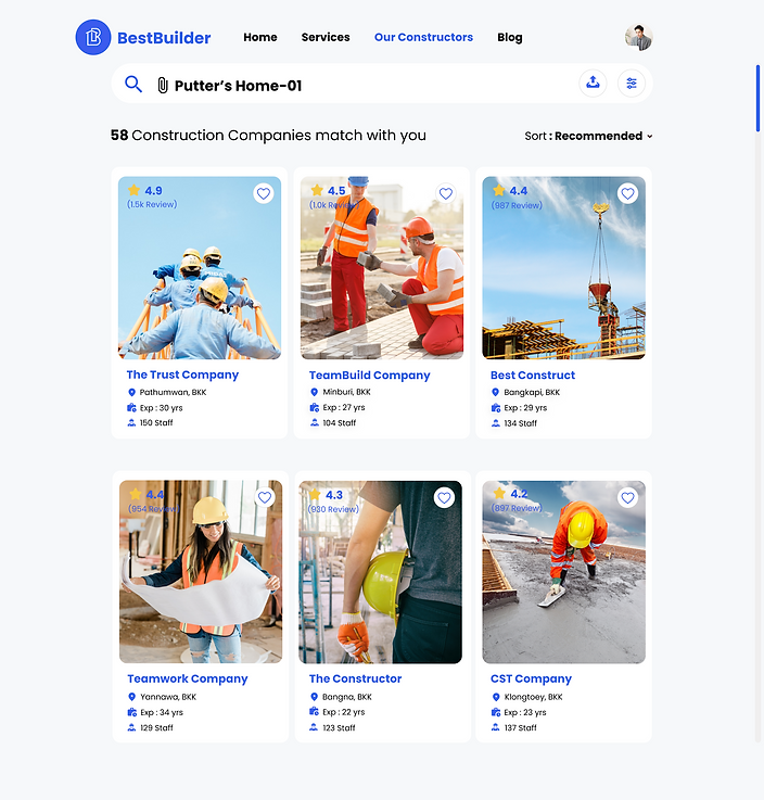
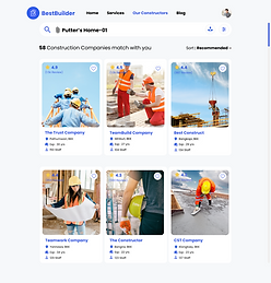
After users have confirmed and saved the quotation form, the next step is the website will show the result of construction companies that match the user’s quotation and requirements by uploading their quotation file from their profile.
The search result will be shown below the search tab. Users can see the company’s profile and further information by clicking on the card.

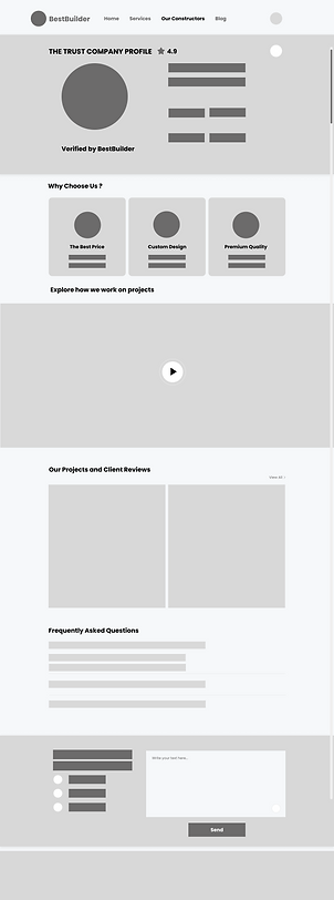
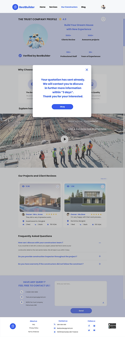
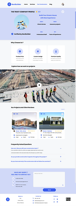
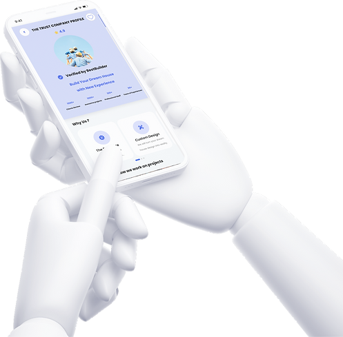
Once users click on the card, they will see the
company’s profile which consists of verifying
icon with BestBuilder. This icon is confirmed
that the website has approved this company.
This section is the company principles
which can induce users to hire them.
Here is a company introduction video of
how they are working on the projects.
Users will get to know more and see
the real working scenes which make users
feel much more reliable.
Client reviews which are also the company’s portfolio, this section will assure users about
the quality and reliability of the company.
This is a frequently asked questions section
that gather what users usually want to know.
The contact form consists of company's
contact information and users can send
message and attach their quotation or any
files to the company.
After users click sent the message.
There will be text popup to inform
about how long the company will contact them back to discuss the further details together.
Responsive Design
Desktop
Frame
1920 x 1080 Resolution
Layout and Columns
Count: 12 Margin: 280 Glutter : 16

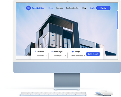
Figma Prototype Desktop: https://bit.ly/3FAESvl
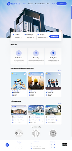


Frame
390 x 844 Resolution
Layout and Columns
Count: 4 Margin: 24 Glutter : 8
Mobile
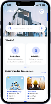
Figma Prototype mobile: http://bit.ly/3iMERLN


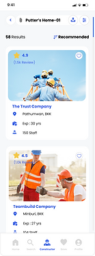
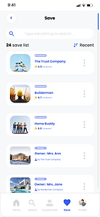
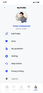
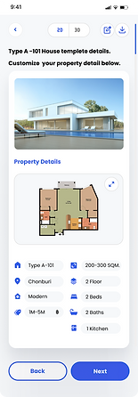


Prototype Preview
Usability Testing
.png)
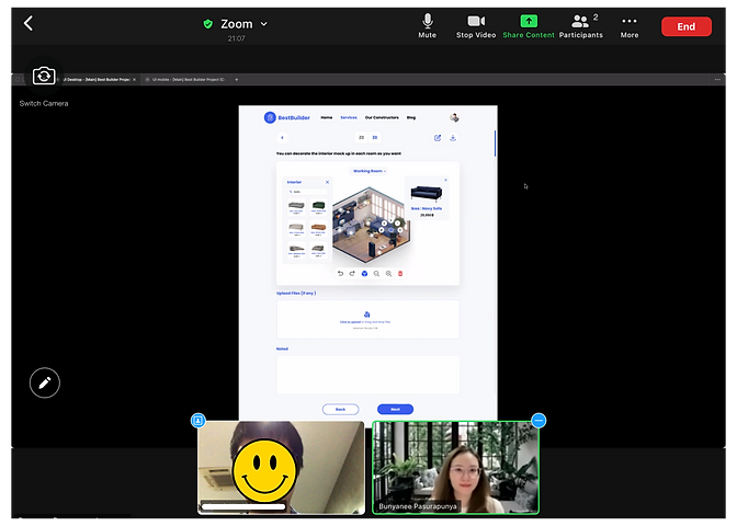
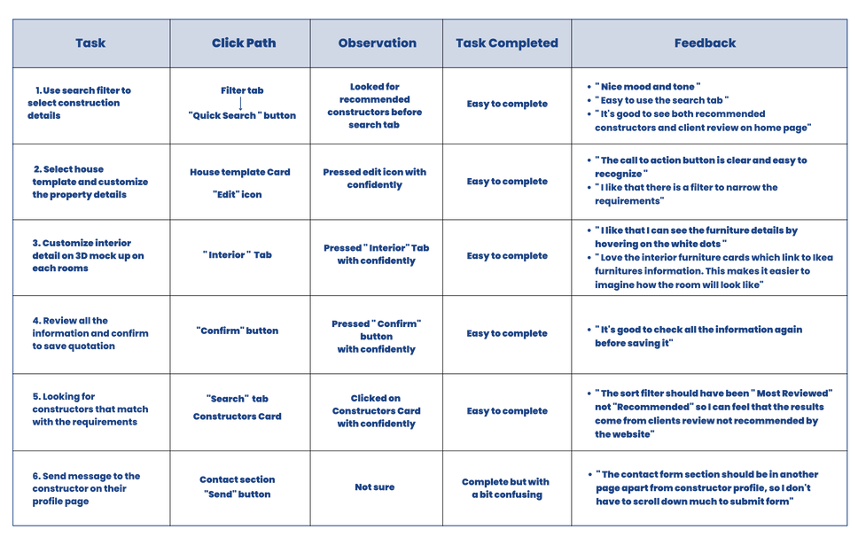
I conducted usability testing for a participant to complete core tasks in the prototype and gathered user feedback for improvement in the future.
I had a video conference with the participant on Zoom Application. Participant has done 6 tasks and I was taking notes and summaries to the table below.
.png)
Future Plans
The Usability testing results are positive and negative outcomes. It helps me want to improve my skill to design better user experiences in the next step.
Here are my future plans:
-
On the constructor's profile review, I will create the overall star rating and percentage breakdown by a star to make the review more trustworthy.
-
I will add a "room size" text field on page 3D mock-up decoration
-
I'm going to create a chatbot for this site, so the user can find where to get help faster.
Lessons I have Learned
Time Management
I have worked independently on this project and sometimes I was focused on little details too much. It’s because I’m a perfectionist, making me spend much longer than expected.
A good question brings the good answer
I’ve learned from user interviews that if we want to know the core of a user pain point and understand the actual causes, we need to put in place a good question that is related to the objective of the research without guiding the answers to them. I will keep sharpening my questions and learning for more experiences.
Construction
You Can Count On
.png)